Documentation
Parley - Business Consulting HTML Template
Thank you so much for purchasing our item from themeforest.
- Version: 1.0
- Author: fourgency
- Created: 20 June, 2022
If you have any questions that are beyond the scope of this help file, Please feel free to email via Item Support Page.
Installation
Follow the steps below to setup your site template:
- Unzip the downloaded package and open the /HTML folder to find all the template files. You will need to upload these files to your hosting web server using FTP or localhost in order to use it on your website.
- Below is the folder structure and needs to be uploaded to your website or localhost root directory:
HTML/css- Stylesheet filesHTML/images- Images filesHTML/js- Javacript filesHTML/scss- Sass filesHTML/plugins– All external libs.HTML/index.html- Homepage
- You should upload all or specific HTML files as per your need.
- You are good to go for adding your content now!
HTML Structure
Parley follows a simple and easy to customize coding structure. Here is
the sample for your reference:
The template is based on Bootstrap Framework
<!DOCTYPE html>
<html lang="en">
<head>

<!-- Your Title, Description, Stylesheets
============================================= -->

</head>

<body>

<!-- Document Wrapper
=============================== -->
<div class="page-wrapper overflow-hidden">

  <!-- Header
  ============================ -->
  <header class="site-header site-header--dark bg-secondary">
    <div class="container"> ...... </div>
  </header>
  <!-- Header End -->

    <!-- Your Page Content goes here  -->

  <!-- Footer -->
  <footer  class="footer-section">
    <div class="container"> ...... </div>
  </footer>
  <!-- Footer end -->

</div>
<!-- Document Wrapper end -->

<!-- JavaScript -->
</body>
</html>
If you need more information, please visit bootstrap site: https://getbootstrap.com
Sass
We have added SASS .scss files in template. If you know how to use SASS you can change sass
files and compile the css as well.
You can find sass file here - HTML/scss
Open the sass/abstract and Edit any file according to your needs. If you need more Advanced
Setup then you can Edit the Respective Files yourself which have been branched inside the same Folder. It
is completely at your discretion only to include the Required .scss Files you need to
minimize the amount of CSS & including only the Styles of the Blocks you need. This can be setup in your
main.scss File.
Color Customization
You can change your Website's Colors by modifying following variable inside
HTML/scss/abstract/_colors.scss
Available Variables:
$white : #fff;
$black : #000;
$cornflower-blue : #6460EF;
$comet : #555C71;
$big-stone : #171F36;
$heading-color: $big-stone;
$text-color:$comet;
$text-light:$white;
$text-light-opacity:rgba($white,.7);
$header-link-color: $cornflower-blue;
$btn-link-color: $cornflower-blue;

$primary: $cornflower-blue;
$secondary: $big-stone;
$text: $comet;
Theme Customization
We have include a Custom CSS File in the css Folder so that you can better handle your
Customizations for New Styles or
Overwriting Default Theme Styles. Simply add all your Custom CSS Codes in the css/custom.css
File and link it in the Document <head> after the css/main.css Linking.
Also make sure that this is the Last Linked CSS File in the Document <head> so that
your Custom CSS Styles are Overwritten properly.
<head>

<!-- Bootstrap , fonts & icons  -->
<link rel="stylesheet" href="./css/bootstrap.css">
<link rel="stylesheet" href="./fonts/fontawesome-5/css/all.css">

<!-- Plugin'stylesheets  -->
<link rel="stylesheet" type="text/css"href="./plugins/aos/aos.min.css">
<link rel="stylesheet" type="text/css" href="./plugins/fancybox-4/fancybox.min.css">
<link rel="stylesheet" type="text/css" href="./plugins/nice-select/nice-select.min.css">
<link rel="stylesheet" type="text/css" href="./plugins/slick/slick.min.css">
<link rel="stylesheet" type="text/css" href="./plugins/slick/slick-theme.css" />
<link rel="stylesheet" type="text/css" href="./fonts/parley-icon-font/style.css" />
<link rel="stylesheet" type="text/css" href="./css/component-page.css" />

<!-- Vendor stylesheets  -->
<link rel="stylesheet" type="text/css" href="./css/main.css">

<!-- Here goes your custom.css
============================================= -->
<link rel="stylesheet" type="text/css" href="./css/custom.css" />
</head>
Logo Settings
The Logo can be found in the Header Container and Footer Container
Header logo:
<!-- Logo -->
  <a class="navbar-brand" href="#">
    <img class="w-100" src="./image/png/logo-light.png" alt="logo" />
  </a>
<!-- Logo End -->
Footer logo:
<!-- Footer Logo -->
  <a class="footer-brand" href="/">
    <img src="./image/png/logo-light.png" alt="footer"/>
  </a>
<!-- Footer Logo End -->
Layout
Documentation and examples for header, footer, grid
Header
The list of various header types & its descriptions are provided below for your reference:
Transparent
Header with white background Color & Dark text. See below image and code for more inforamtion.
<!-- Header
============================ -->
<header class="site-header site-header--transparent">
  <div class="container">
    <nav class="navbar navbar-expand-lg">
        ...
    </nav>
  </div>
</header>
<!-- Header End -->
Dark
Header with dark background & Light text. See below image and code for more inforamtion.

<!-- Header
============================ -->
<header class="site-header site-header--dark">
  <div class="container">
    <nav class="navbar navbar-expand-lg">
        ...
    </nav>
  </div>
</header>
<!-- Header End -->
Grid Style
Default Layout Style is wide. Please see the grid box layout. You can easy to customize coding structure. Here is the sample for your reference:
Grid 2 column

grid style 1
<!-- Blog 2 column -->
<div class="blog-inner">
<div class="container">
  <!-- Blog card-->
  <div class="row justify-content-center">
    <div class="col-sm-9 col-md-6  mb-5">
      <!-- Blog card-->
      <!--Blog Card Single -->
      <a href="./blog-details.html" class="d-block blog-card hover-visible-2">
        <div class="card-image">
          <img src="./image/png/blog-inner-img-1.png" alt="blog">
        </div>
        <div class="card-body">
          <div class="card-body-inner">
            <h4 class="card-title">10 tips for managing small business finances</h4>
            <p class="card-text">If you are going to use a passage labor. Sed, reprehenderit.Lorem ipsum dolor sit amet consectetur adipisicing elit. Sed, reprehenderit. </p>
            <span class="card-link">Read More</span>
          </div>
        </div>
      </a>
    </div>
    <div class="col-sm-9 col-md-6  mb-5">
      <!-- Blog card-->
      <!--Blog Card Single -->
      <a href="./blog-details.html" class="d-block blog-card hover-visible-2">
        <div class="card-image">
          <img src="./image/png/blog-inner-img-3.png" alt="blog">
        </div>
        <div class="card-body">
          <div class="card-body-inner">
            <h4 class="card-title">Plan your project with your software.</h4>
            <p class="card-text">If you are going to use a passage labor. Sed, reprehenderit.Lorem ipsum dolor sit amet consectetur adipisicing elit. Sed, reprehenderit. </p>
            <span class="card-link">Read More</span>
          </div>
        </div>
      </a>
    </div>
  </div>
</div>
</div>
Grid 3 column

grid style 2
<!-- Blog 3 column -->
<div class="blog-inner">
<div class="container">
  <!-- Blog card-->
  <div class="row justify-content-center">
    <div class="col-12 col-xs-10 col-sm-9 col-md-6 col-xl-4  mb-5">
      <!-- Blog card-->
      <!--Blog Card Single -->
      <a href="./blog-details.html" class="d-block blog-card hover-visible-2">
        <div class="card-image">
          <img src="./image/png/blog-inner-img-1.png" alt="blog">
        </div>
        <div class="card-body">
          <div class="card-body-inner">
            <h4 class="card-title">10 tips for managing small business finances</h4>
            <p class="card-text">If you are going to use a passage labor. Sed, reprehenderit.Lorem ipsum dolor sit amet consectetur adipisicing elit. Sed, reprehenderit. </p>
            <span class="card-link">Read More</span>
          </div>
        </div>
      </a>
    </div>
    <div class="col-12 col-xs-10 col-sm-9 col-md-6 col-xl-4  mb-5">
      <!-- Blog card-->
      <!--Blog Card Single -->
      <a href="./blog-details.html" class="d-block blog-card hover-visible-2">
        <div class="card-image">
          <img src="./image/png/blog-inner-img-2.png" alt="blog">
        </div>
        <div class="card-body">
          <div class="card-body-inner">
            <h4 class="card-title">How to take a holiday from your business</h4>
            <p class="card-text">If you are going to use a passage labor. Sed, reprehenderit.Lorem ipsum dolor sit amet consectetur adipisicing elit. Sed, reprehenderit. </p>
            <span class="card-link">Read More</span>
          </div>
        </div>
      </a>
    </div>
    <div class="col-12 col-xs-10 col-sm-9 col-md-6 col-xl-4  mb-5">
      <!-- Blog card-->
      <!--Blog Card Single -->
      <a href="./blog-details.html" class="d-block blog-card hover-visible-2">
        <div class="card-image">
          <img src="./image/png/blog-inner-img-3.png" alt="blog">
        </div>
        <div class="card-body">
          <div class="card-body-inner">
            <h4 class="card-title">Plan your project with your software.</h4>
            <p class="card-text">If you are going to use a passage labor. Sed, reprehenderit.Lorem ipsum dolor sit amet consectetur adipisicing elit. Sed, reprehenderit. </p>
            <span class="card-link">Read More</span>
          </div>
        </div>
      </a>
    </div>
  </div>
</div>
</div>
Content
Documentation and examples for displaying typography, table, image and video and more..
Typography
Documentation and examples for typography, headings, body text, lists, and more.
Headings
| Heading | Example |
|---|---|
<h1></h1> |
h1. Heading |
<h2></h2> |
h2. Heading |
<h3></h3> |
h3. Heading |
<h4></h4> |
h4. Heading |
<h5></h5> |
h5. Heading |
<h6></h6> |
h6. Heading |
Text
Make a paragraph stand out by adding .text
Lorem Ipsum is simply dummy text of the printing and typesetting industry. Anim pariatur cliche reprehenderit, enim eiusmod high life accusamus terry richardson ad squid.
<p class="text">
   Lorem Ipsum is simply dummy text of the printing and typesetting industry. Anim pariatur cliche reprehenderit, enim eiusmod high life accusamus terry richardson ad squid.
</p>
Inline Text elements
You can use the mark tag to highlight text.
This line of text is meant to be treated as deleted text.
This line of text is meant to be treated as no longer accurate.
This line of text is meant to be treated as an addition to the document.
This line of text will render as underlined
This line of text is meant to be treated as fine print.
This line rendered as bold text.
This line rendered as italicized text.
<p>You can use the mark tag to <mark>highlight</mark> text.</p>
<p><del>This line of text is meant to be treated as deleted text.</del></p>
<p><s>This line of text is meant to be treated as no longer accurate.</s></p>
<p><ins>This line of text is meant to be treated as an addition to the document.</ins></p>
<p><u>This line of text will render as underlined</u></p>
<p><small>This line of text is meant to be treated as fine print.</small></p>
<p><strong>This line rendered as bold text.</strong></p>
<p><em>This line rendered as italicized text.</em></p>
Table
Documentation and examples for opt-in styling of tables.
Parley is based on Bootstrap 5, so you can easily use Bootstrap's table classes to style your table. Bootstrap Documentation
Bordered
<table class="table table-bordered">
   .......
</table>| # | First | Last | Handle |
|---|---|---|---|
| 1 | Mark | Otto | @mdo |
| 2 | Jacob | Thornton | @fat |
| 3 | Larry | the Bird |
Striped
<table class="table table-bordered table-striped">
   .......
</table>| # | First | Last | Handle |
|---|---|---|---|
| 1 | Mark | Otto | @mdo |
| 2 | Jacob | Thornton | @fat |
| 3 | Larry | the Bird |
NoteYou can refer more information in Bootstrap Documentation here: Bootstrap Documentation
Icons
Font Awesome 5 icons are supported in Parley.
<i class="fas fa-mobile-alt"></i>
<i class="fab fa-twitter"></i>
<i class="fas fa-credit-card"></i>
<i class="fab fa-facebook-f"></i>
NotePlease go to their official documentation pages for a full list of icons: Font Awesome
Image
Documentation and examples for opting images into responsive behavior and add lightweight styles to them—all via classes.
Responsive Images
Images in Bootstrap are made responsive with .img-fluid. max-width: 100%; and
height: auto; are applied to the image so that it scales with the parent element.

<img src="assets/images/consult-hero-img.png" class="img-fluid" alt="Responsive image">Image lightbox
Show image popup when click on image:

<a data-fancybox="images" href="assets/images/hero-2-img-2.png">
  <img src="assets/images/screenshot-thumb.jpg" class="img-fluid img-thumbnail" alt="image">
</a>
Image Lightbox with Link
Show image popup when click on link: Click Here for Popup Image
<a data-fancybox="images" href="assets/images/hero-2-img-2.png">Click Here for Popup Image</a>Image lightbox with Button
Show image popup when click on button: Click Here for Popup Image
<a class="btn btn-primary" data-fancybox="images" href="assets/images/hero-2-img-2.png">Click Here for Popup Image</a>Video
Create responsive video embeds based on the width of the parent by creating an intrinsic ratio that scales on any device.
Embedded Video
Wrap any embed like an <iframe> in a parent element with
.embed-responsive and an aspect ratio. The .embed-responsive-item isn’t strictly
required, but we encourage it.
<div class="embed-responsive embed-responsive-16by9">
  <iframe class="embed-responsive-item" src="https://www.youtube.com/embed/7e90gBu4pas" allowfullscreen></iframe>
</div>NotePlease go to official bootstrap documentation for a full information of embed video: Bootstrap Documentation
Popup with Video
Show Youtube and Vimeo video popup when click on link:
<a class="popup-youtube" data-fancybox href="http://www.youtube.com/watch?v=7e90gBu4pas">Open Popup YouTube Video </a><a class="popup-vimeo" data-fancybox href="https://vimeo.com/45830194">Open Popup Vimeo video</a>Components
Setting up components is very easy. Here is the Some of shortcodes describe. also, Parley is based on Bootstrap 5, so you can easily use Bootstrap's components: Bootstrap Documentation
Accordion
You can extend the default collapse behavior to create an accordion. To properly achieve the accordion
style, be sure to use .accordion as a wrapper.
See below image and code for more inforamtion.
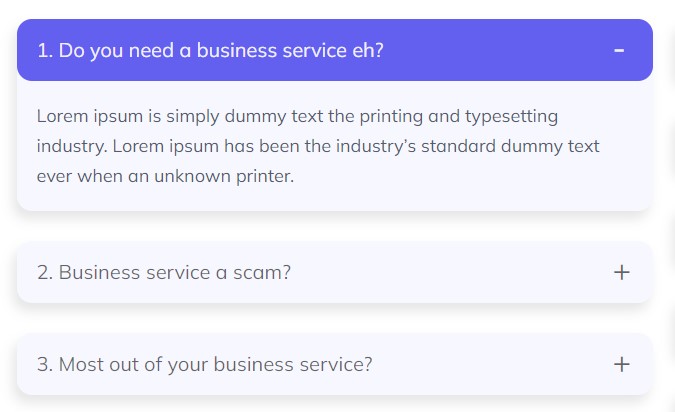
Accordion style 1 :
<div class="accordion accordion-style-1" id="faqAccordion">
<div class="row gy-6">
<div class="col-lg-6">
    <div class="row gy-6">
        <div class="col-12">
            <div class="accordion-item">
              <h2 class="accordion-header" id="accordionOneHeading">
                <button class="accordion-button " type="button" data-bs-toggle="collapse" data-bs-target="#accordionOneCollapse" aria-expanded="" aria-controls="accordionOneCollapse">
                  1. Do you need a business service eh?
                </button>
              </h2>
              <div id="accordionOneCollapse" class="accordion-collapse collapse show" aria-labelledby="accordionOneHeading" data-bs-parent="#faqAccordion">
                <div class="accordion-body">
                  <p>Lorem ipsum is simply dummy text the printing and typesetting industry. Lorem
                    ipsum has been the industry’s standard dummy text ever when an unknown
                    printer.</p>
                </div>
              </div>
            </div>
          </div>
          <div class="col-12">
            <div class="accordion-item">
              <h2 class="accordion-header" id="accordionTwoHeading">
                <button class="accordion-button collapsed" type="button" data-bs-toggle="collapse" data-bs-target="#accordionTwoCollapse" aria-expanded="" aria-controls="accordionTwoCollapse">
                  2. Business service a scam?
                </button>
              </h2>
              <div id="accordionTwoCollapse" class="accordion-collapse collapse " aria-labelledby="accordionTwoHeading" data-bs-parent="#faqAccordion">
                <div class="accordion-body">
                  <p>Lorem ipsum is simply dummy text the printing and typesetting industry. Lorem
                    ipsum has been the industry’s standard dummy text ever when an unknown
                    printer.</p>
                </div>
              </div>
            </div>
          </div>
          <div class="col-12">
            <div class="accordion-item">
              <h2 class="accordion-header" id="accordionThreeHeading">
                <button class="accordion-button collapsed" type="button" data-bs-toggle="collapse" data-bs-target="#accordionThreeCollapse" aria-expanded="" aria-controls="accordionThreeCollapse">
                  3. Most out of your business service?
                </button>
              </h2>
              <div id="accordionThreeCollapse" class="accordion-collapse collapse " aria-labelledby="accordionThreeHeading" data-bs-parent="#faqAccordion">
                <div class="accordion-body">
                  <p>Lorem ipsum is simply dummy text the printing and typesetting industry. Lorem
                    ipsum has been the industry’s standard dummy text ever when an unknown
                    printer.</p>
                </div>
              </div>
            </div>
          </div>
    </div>
</div>
</div>
</div>
Options:
| Type Class | Features | Code Example |
|---|---|---|
.accordion-style-1 |
Alternate Minimal Style for the accordions. |
|
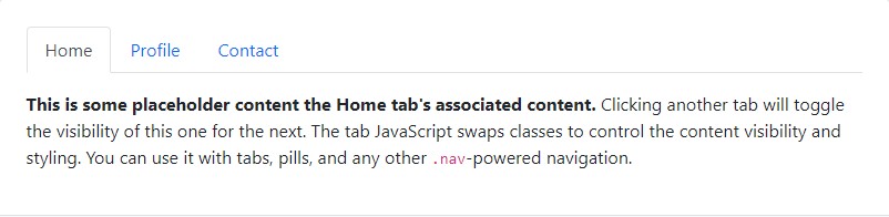
Tabs
Default Bootstrap Nav component combined with Parley for unique tabs.
See below image and code for more inforamtion.
<ul class="nav nav-tabs" id="myTab" role="tablist">
  <li class="nav-item" role="presentation">
    <button class="nav-link active" id="home-tab" data-bs-toggle="tab" data-bs-target="#home" type="button" role="tab" aria-controls="home" aria-selected="true">Home</button>
  </li>
  <li class="nav-item" role="presentation">
    <button class="nav-link" id="profile-tab" data-bs-toggle="tab" data-bs-target="#profile" type="button" role="tab" aria-controls="profile" aria-selected="false">Profile</button>
  </li>
  <li class="nav-item" role="presentation">
    <button class="nav-link" id="contact-tab" data-bs-toggle="tab" data-bs-target="#contact" type="button" role="tab" aria-controls="contact" aria-selected="false">Contact</button>
  </li>
</ul>
<div class="tab-content" id="myTabContent">
  <div class="tab-pane fade show active" id="home" role="tabpanel" aria-labelledby="home-tab">...</div>
  <div class="tab-pane fade" id="profile" role="tabpanel" aria-labelledby="profile-tab">...</div>
  <div class="tab-pane fade" id="contact" role="tabpanel" aria-labelledby="contact-tab">...</div>
</div>
Slider
You can extend the default class to create an slider. To properly achieve the slider
style, be sure to use .slider-area as a wrapper.
See below image and code for more inforamtion.
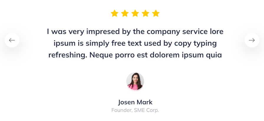
Slider style 1 :
<div class="testimonial-slider">
  <div class="single-item">
    <div class="testimonial-ratings-block">
      <div class="icon-single">
        <span class="parley-star-icon"></span>
      </div>
      <div class="icon-single">
        <span class="parley-star-icon"></span>
      </div>
      <div class="icon-single">
        <span class="parley-star-icon"></span>
      </div>
      <div class="icon-single">
        <span class="parley-star-icon"></span>
      </div>
      <div class="icon-single">
        <span class="parley-star-icon"></span>
      </div>
    </div>
    <div class="testimonial-content">
      <h4>I want to thank you for the excellent work, directed by <br class="d-none d-xl-block">
        you
        and you team, regarding for regulatory services for <br class="d-none d-xl-block"> our USA surgical
        face
        masks.</h4>
    </div>
    <div class="user-block">
      <div class="user-image">
        <img src="./image/png/slider-user.png" alt="user">
      </div>
      <div class="user-details">
        <h4 class="user-name">Jenny Wilson</h4>
        <span>Founder, SME Corp.</span>
      </div>
    </div>
  </div>

</div>

Slider style 2 :
<div class="slider-area">
<div class="slider-testimonial-2">
  <div class="single-slider">
    <!--~~~~~~ Testimonial Card Single ~~~-->
    <div class="testimonial-card">
      <div class="card-texts">
        <p>When our previous IT provider went out of business. ITECH system stepped in and took over They’ve worked with us to develop a disaster recovery.</p>
      </div>
      <div class="user-details">
        <div class="user-image">
          <img src="./image/png/testimonial-2-card-1.png" alt="testimonial">
        </div>
        <div class="user-texts">
          <h4 class="user-name card-title">Eva Clarke</h4>
          <p>Founder, SME Corp.</p>
        </div>
      </div>
      <div class="card-icon">
        <img src="./image/png/quote-img.png" alt="testimonial">
      </div>
    </div>
  </div>

</div>
</div>

Slider style 3 :
<div class="slider-area position-relative">
<div class="testimonial-slider-3">
  <div class="single-slider">
    <!--~~~~~~ Testimonial Card Single ~~~-->
    <div class="testimonial-card-3">
      <div class="user-details">
        <div class="user-image">
          <img src="./image/png/testimonial-2-card-1.png" alt="testimonial">
        </div>
        <div class="user-texts">
          <h4 class="user-name card-title">Jenny Wilson</h4>
          <p class="card-text">Founder, SME Corp.</p>
        </div>
      </div>
      <div class="">
        <p class="card-text--md text-white">I want to thank you for the excellent work, directed by you and
          you team, regarding for regulatory services for our USA surgical face masks.</p>
      </div>
      <div class="card-icon">
        <span class="parley-quote-ending-icon">
      </div>
    </div>
  </div>
</div>
</div>
Social Icon
Social links with different styles. See below code for more information.
<ul class="social-icon list-unstyled">
<li><a class="icon-link" href=""><i class="fab fa-facebook-f"></i></a></li>
<li><a class="icon-link" href=""><i class="fab fa-twitter"></i></a></li>
<li><a class="icon-link" href=""><i class="fab fa-instagram"></i></a></li>
<li><a class="icon-link" href=""><i class="fab fa-linkedin-in"></i></a></li>
</ul>
Helper Classes
We have created some really useful helper classes for you. Here are a few of them. also, You can refer other default bootstrap helper classes here: Bootstrap Documentation
Text Size:
.heading- font-size to 54px.heading--xl- font-size to 80px.heading--lg- font-size to 40px..heading--md- font-size to 22px..heading--sm- font-size to 18px..heading--xs- font-size to 12px..text- font-size to 20px.text--lg- font-size to 30px..text--md- font-size to 26px..text--sm- font-size to 16px..text--xs- font-size to 16px.
Font Weight:
.fw-400- For font weight of 400..fw-500- For font weight of 500..fw-600- For font weight of 600..fw-700- For font weight of 700.
Background Color:
.bg-transparent- For background color of transparent.site-header--fill-dark- For header background color of dark blue.site-header--fill-light- For header background color of light.bg-commet-opacity- For background color of light gray.bg-primary- For background color of primary.bg-secondary- For background color of secondary
Borders, Sizing, Spacing (margin & padding) and also much more....
FAQ
A FAQ is a list of frequently asked questions (FAQs) and answers on a particular topic.
Please note that there may be some limits placed on uses under the different license types available on the marketplaces.
- You can buy an HTML site template, convert it to WordPress, and use it as your website (but not as a stock template for sale).
Source & Credits
Images:
- Freepik - https://www.freepik.com/
- Unsplash - https://unsplash.com/
- Pexels - https://www.pexels.com/
Fonts:
- Icons Font Face - https://fontawesome.com/
- Custom Icon Font - parley icon - https://icomoon.com/
- Typography Font - https://fonts.google.com/
Scripts:
- jQuery - http://www.jquery.com/
- Bootstrap 5 - https://getbootstrap.com/docs/5.0/getting-started/introduction/
- Nice select Js - https://jqueryniceselect.hernansartorio.com/
- jQuery Fancybox - http://fancybox.com/
- Slick - https://kenwheeler.github.io/slick/
- Aos - https://michalsnik.github.io/aos/
Support
If this documentation doesn't answer your questions, contact us via item support page: Item Support Page
We are located in GMT +6:00 time zone and we answer all questions within 24 hours in weekdays. In some rare cases the waiting time can be to 48 hours. (except holiday seasons which might take longer).
Don’t forget to Rate this template
Go to your Themeforest Profile > Downloads Tab > & then You can Rate & Review for our template.
Thank You.
More Templates
Keep up to date with our latest template


Changelog
See what's new added, changed, fixed, improved or updated in the latest versions.
For Future Updates Follow Us on @themeforest / @facebook
Version 1.0 (22 june, 2022)
Initial Release